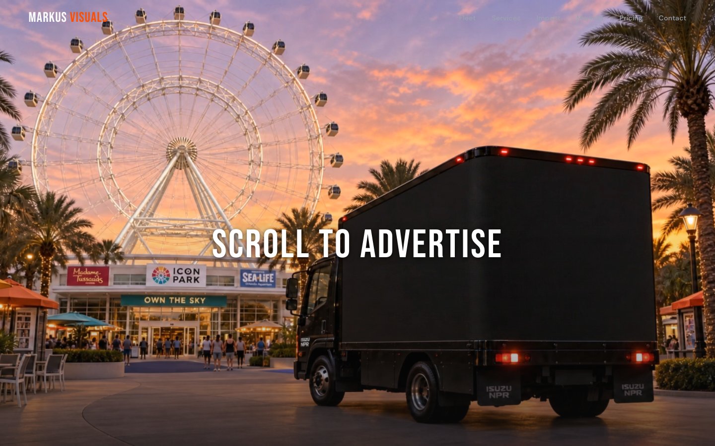
A mobile LED billboard advertising company needed a B2B site that communicated the physical scale and impact of their trucks. We built a dark, bold experience with scroll-driven reveals, coverage maps, and case studies that sell.
Markus Visuals operates a fleet of mobile LED billboard trucks — massive, high-resolution screens mounted on vehicles that drive through high-traffic areas. Their service is inherently physical and visual, but their online presence was a basic landing page that couldn't convey the scale or impact of their medium.
The brief: build a B2B site that makes business owners feel the presence of a 10-foot LED screen driving through their target market. The site needed to generate qualified leads from event organizers, festival promoters, fitness brands, and local businesses who want impossible-to-ignore advertising.
Target audience: marketing managers and business owners with $2,000-$10,000 monthly ad budgets who are tired of being ignored on social media and want something their audience can't scroll past.
The medium is the message. LED billboards are big, bold, and impossible to ignore — the website needed to feel the same way. Dark background so the LED screens glow. Sunset photography creates aspiration. Bold uppercase type matches the billboard medium — big, bold, impossible to ignore.
We chose dark navy/black as the base so that every image of an LED truck glows like it does on an actual street at dusk. Sunset orange became the accent color — pulled from the golden-hour photography that makes the trucks look most dramatic.
The "SCROLL TO ADVERTISE" hero interaction puts the visitor in control. As they scroll, the LED truck's screen lights up with their city's name. It's not decoration — it's a demonstration of how the product works, compressed into a 3-second interaction.
1. Dark canvas, glowing content. Navy/black backgrounds make LED screen imagery pop — the trucks look like they're actually lit up on the page.
2. Bold type = billboard type. Condensed uppercase headings mirror the typography you'd actually see on a billboard. The website feels like the product.
3. Proof through case studies. Real campaign examples (festival promotion, fitness launch) with results data. B2B buyers need evidence, not promises.
4. Service clarity. A breakdown of coverage areas, truck specs, and pricing tiers removes the "How much does this cost?" friction that kills B2B leads.
Light/white backgrounds. The LED screens disappear against white — they need darkness to glow. Every competing billboard company makes this mistake, using white backgrounds that flatten their most compelling visual asset.
We also rejected playful or casual design. This is a B2B service with $5,000+ contracts. The design needs to communicate scale, professionalism, and ROI. Rounded corners and pastel colors signal consumer products, not enterprise-grade advertising infrastructure.
Nighttime meets golden hour. Dark navy base, sunset orange for energy and CTAs, white for legibility, with the LED screens providing their own neon color accents in photography.
The page builds a case for mobile LED advertising, section by section:
Hero (LED truck with "SCROLL TO ADVERTISE" interaction) → How It Works (book → design → deploy) → Coverage Maps (cities and routes) → Case Studies (festival campaign, fitness launch with metrics) → Services (truck specs, screen sizes, campaign types) → Pricing → Lead Gen Form
Single-file HTML with GSAP for scroll-driven animations. The dark theme and bold typography are pure CSS — no frameworks needed. AI-generated imagery fills the photography gap until the client provides real truck photos from campaigns.
Scroll-driven hero. The LED truck hero uses ScrollTrigger to animate the screen content as the user scrolls. The billboard display cycles through city names and campaign examples, demonstrating the product in motion without autoplay video.
Coverage map interaction. An SVG-based map highlights service areas on hover, with city names and route details appearing in a sidebar. Built with pure CSS transitions and minimal JS — no map library overhead.
Case study cards. Each case study (festival promotion, fitness brand launch) is a self-contained section with campaign photos, impressions data, and a client quote. The layout uses alternating image/text sides to maintain visual rhythm.
B2B lead generation form. The contact form captures company name, campaign type, budget range, and preferred start date. Fields are ordered by commitment level (low to high) to reduce abandonment. Form submissions go to the client's CRM via webhook.
Markus Visuals now has a digital presence that matches the physical impact of their LED trucks. The dark, bold design makes their service feel premium and impossible to ignore — exactly how a 10-foot glowing billboard should make you feel.
Visit the live site →Tell us about your project. We'll come back with a first idea within hours.