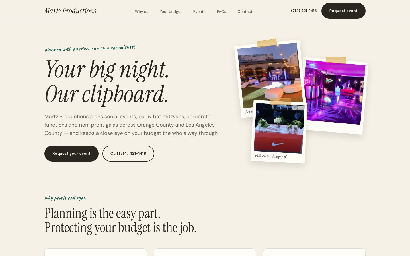
An event planner known for budget precision needed a site that conveyed both creative vision and financial discipline. The tagline "planned with passion, run on a spreadsheet" captures the brand perfectly.
Martz Productions is an event planning company operating across Orange County and Los Angeles, handling everything from social events and bar/bat mitzvahs to corporate functions and non-profit galas. Ryan, the founder, had a reputation for meticulous budget management but no website that reflected it.
The brief was clear: build a site that feels both creatively exciting and financially trustworthy. Event planners live in a space where clients want magic but also need to see the numbers. Most planner sites lean too far into one direction — either all Pinterest mood boards or all corporate spreadsheets.
Target audience: hosts planning milestone celebrations or corporate events in the LA/OC area who want a planner they can trust with both the vision and the budget.
We needed to balance two opposing forces: creative warmth and financial discipline. The site had to feel like a celebration (not a corporate brochure) while simultaneously building trust through transparency and structure.
The italic tagline "planned with passion, run on a spreadsheet" became our design compass. Every decision traced back to that duality — expressive typography paired with structured layouts, playful colors grounded by clean grids.
The polaroid-style event archive adds warmth and nostalgia — it feels personal, like flipping through someone's memory collection rather than scrolling a generic gallery. The budget breakdown section with its teal background creates a distinct "show your numbers" moment that builds client trust.
1. Duality as identity. Creative passion and spreadsheet precision coexist in every section. Neither dominates.
2. Polaroid nostalgia. The event archive uses a polaroid-style layout that makes past events feel like personal memories, not portfolio items.
3. Budget transparency. A dedicated teal-background section breaks down costs openly. No "contact for pricing" — show the numbers, build the trust.
4. Six reasons, not a wall of text. The "why people call Ryan" benefit cards distill the value proposition into scannable, confident statements.
Soft pastels, script fonts, floral patterns — the default event planner aesthetic. Ryan's brand is bold and structured, not delicate. We went with punchy colors (violet, coral, lemon yellow) and heavyweight Syne typography instead.
We also rejected hiding the budget conversation. Most planner sites treat pricing as a secret. We made it a feature — the teal budget section is one of the most visually distinct moments on the page, turning a typically awkward conversation into a trust-building asset.
A bold, celebratory palette built around violet energy, coral warmth, and lemon yellow accents — all grounded by an off-white background and near-black text for readability.
The page flows through a narrative that mirrors the client journey:
Hero (bold Syne headline + italic tagline) → Event archive (polaroid-style grid of past events) → Why people call Ryan (6 benefit cards) → Budget breakdown (teal background section with cost transparency) → Services (social events, bar/bat mitzvahs, corporate, non-profit galas) → Contact
Single-file HTML architecture. No framework, no build step, no dependencies beyond GSAP for scroll-driven animations. This keeps the site fast, portable, and easy to update.
Polaroid event archive. Each past event is displayed as a slightly rotated card with a white border and handwritten-style caption, creating the feeling of physical photos scattered on a table. CSS transforms handle the rotation, and GSAP staggers the reveal on scroll.
Budget breakdown section. The teal background section uses a distinct color block to visually separate the numbers conversation from the rest of the site. This "show your numbers" moment is deliberate — it signals confidence and transparency.
Benefit cards. Six cards answering "why people call Ryan" use a clean grid layout with violet accent borders. Each card is concise — one headline, one supporting sentence. No fluff.
Shared type system. Syne + Figtree is the same foundation used on the TMM Productions site, but the color palette, layout rhythm, and component styling give Martz a completely distinct personality — proof that a type system can flex across brands.
The finished site delivers a brand experience that captures both sides of Ryan's value proposition — creative vision and budget discipline. The polaroid archive adds personal warmth, the benefit cards build confidence, and the budget section turns transparency into a competitive advantage.
Visit the live site →Tell us about your project. We'll come back with a first idea within hours.