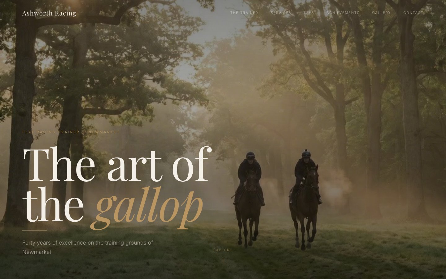
A Newmarket flat racing trainer with 40 years of experience needed a website that matched the prestige of British racing. We built an editorial experience with heritage typography, misty photography, and an elegant green palette drawn from the turf itself.
Ashworth Racing is a Newmarket-based flat racing trainer with four decades of experience producing winners. Despite an impeccable reputation on the track, their digital presence was limited to word-of-mouth referrals and an outdated listing on racing directories.
The brief was clear: build a site that conveys the heritage and prestige of British flat racing. Prospective owners spending six figures on yearlings expect a trainer's presentation to reflect that caliber. The site needed to showcase the stable's history, display transparent training fees, present a gallery of past winners, and make first contact effortless.
Target audience: high-net-worth individuals considering racehorse ownership, existing owners evaluating trainers, and bloodstock agents looking for a professional stable to recommend.
We studied the aesthetics of British racing culture — the morning mists on Newmarket heath, the green of the gallops, the cream pages of Weatherbys catalogues. The visual language needed to say heritage, not hustle.
We chose a deep forest green palette drawn from the racing turf, paired with cream and warm gold accents. The typography leans on an elegant serif display face (Cormorant-like) for headlines — evoking the tradition of racing broadsheets — with a clean sans-serif body for readability.
The full-bleed misty gallop hero sets the tone immediately: atmospheric, prestigious, unhurried. Every section that follows maintains that calm authority.
1. Heritage over hype. Serif typography and muted photography convey decades of tradition without trying too hard.
2. Atmosphere first. Misty dawn photography creates an emotional connection to the Newmarket gallops before a word is read.
3. Transparent fees. Training rates, jockey fees, and ancillary costs displayed upfront. Serious owners appreciate directness.
4. Gallery as proof. Past winners and stable photography replace testimonials. In racing, results speak louder than words.
Flashy animations, bold colors, aggressive CTAs. The temptation with sports sites is to go high-energy. We went the opposite direction — measured, refined, editorial. The kind of brand that whispers confidence.
We also rejected typical equestrian templates with clip-art horse silhouettes and banner-ad layouts. Every element was custom — from the misty AI-generated hero photography to the hand-tuned green palette that avoids looking like a golf course.
Drawn from the Newmarket landscape: deep forest greens from the gallops, cream from the racing silks, warm gold from brass stable fittings, and brown from saddle leather.
The page follows a narrative arc that mirrors a visitor's decision journey:
Hero (full-bleed misty gallop photograph + stable name) → About (40-year heritage, training philosophy) → Gallery (past winners, stable facilities) → Fees (transparent pricing breakdown) → Contact (enquiry form for prospective owners)
Single-file HTML architecture for maximum portability and speed. GSAP handles scroll-triggered reveals that feel measured and intentional — matching the unhurried pace of the brand. AI-generated photography filled the gap where no professional shoot existed.
Full-bleed hero. The misty gallop photograph spans the full viewport with no padding or overlay text competing for attention. The stable name appears below the fold, letting the atmosphere set the tone first.
AI-generated photography. With no budget for an on-location Newmarket shoot, we used AI to generate atmospheric dawn photography — horses on the heath, stable interiors, close-ups of tack — all maintaining consistent lighting and color grading.
Fee transparency. A structured pricing section breaks down daily training fees, jockey costs, and ancillary charges. Built as a clean data table rather than a pricing card grid — because this audience expects substance, not sales gimmicks.
The finished site delivers a digital presence that matches four decades of racing excellence. Elegant, restrained, and authoritative — exactly the qualities a prospective owner looks for in a trainer.
Visit the live site →Tell us about your project. We'll come back with a first idea within hours.