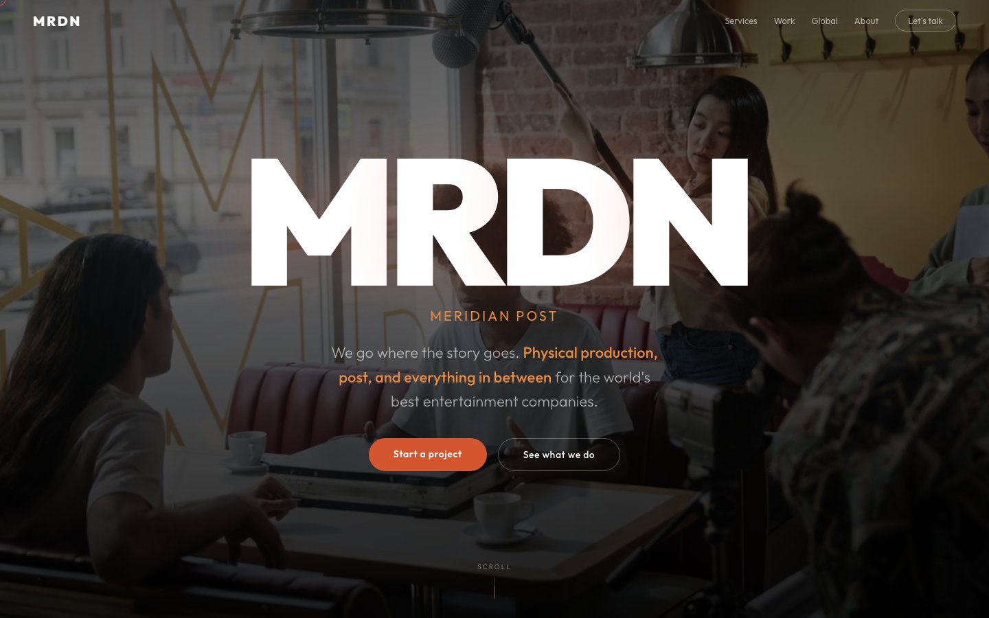
A global production and post-production house needed a web presence as cinematic as their work. We delivered a dark, bold experience with condensed typography, production imagery, and a services grid that communicates worldwide reach.
Meridian Post is a global production and post-production company handling everything from on-set production to color grading, VFX, and final delivery. They work with agencies, brands, and studios across multiple continents — but their website didn't reflect that scale.
The brief: build a site that feels like opening night at a film festival. Dark, cinematic, commanding. The kind of digital presence that makes a creative director say "these people understand craft" before they've even scrolled past the hero.
Target audience: agency producers, brand managers, and studio executives looking for a production partner who can handle end-to-end delivery anywhere in the world.
Production companies live in the dark — editing suites, color grading rooms, screening theaters. We leaned into that world with a near-black background and warm white typography that feels like credits rolling on a cinema screen.
The bold condensed MRDN wordmark in the hero establishes authority immediately. It's not trying to be friendly or approachable — it's a statement. The terracotta/orange accent adds warmth without softening the edge.
Production imagery fills the hero at full bleed, putting the work front and center. The services grid below is structured and scannable — producers are busy people who need to know capabilities at a glance.
1. Cinema-dark palette. Near-black backgrounds with warm white type. The screen is the stage, the work is the show.
2. Bold condensed type. The MRDN wordmark commands attention. Condensed sans-serif says efficiency and confidence — traits producers value.
3. Services clarity. A structured grid of capabilities (production, post, VFX, color, sound) so prospects can self-qualify in seconds.
4. Global reach. A dedicated section showing worldwide presence — because location flexibility is a key differentiator in production.
Showreel-as-homepage. Every production company defaults to a looping video reel. We rejected that because it commoditizes the work — every reel looks the same at 1x speed with no context. Instead, we used a single powerful still image that tells a story.
We also rejected light themes and playful palettes. This is a company that operates in darkened rooms making beautiful things. The site should feel like walking into one of those rooms.
A cinematic palette built from the production environment: near-black from the editing suite, warm white from projection screens, and terracotta from studio warm lighting.
The page moves from impact to information:
Hero (full-bleed production imagery + MRDN bold wordmark) → About (company positioning and philosophy) → Services (structured grid of capabilities) → Work (selected project showcases) → Global reach (worldwide presence) → Contact (enquiry form)
Single-file HTML with GSAP-powered scroll reveals. The dark palette demanded careful attention to contrast ratios and readability. Every animation is restrained — fade-ups and subtle parallax only — because the content is cinematic enough without extra effects.
Single hero image over showreel. A carefully chosen production still loads instantly and tells a stronger story than an auto-playing video that competes with page content. The image is optimized at 1920px wide with aggressive compression — no visible quality loss on dark backgrounds.
Services grid architecture. Built as a CSS Grid with auto-fill columns that gracefully collapse from 3 columns on desktop to 1 on mobile. Each service card has a consistent structure: icon, title, description. Scannable in under 5 seconds.
Global reach section. A text-forward layout listing regions and capabilities rather than an animated globe or map. Maps are cliche in production company sites — a clean list communicates the same information faster.
The finished site establishes Meridian Post as a serious, global production partner. The dark cinematic palette and bold typography create an immediate impression of craft and authority — exactly what their prospects need to see before picking up the phone.
Visit the live site →Tell us about your project. We'll come back with a first idea within hours.