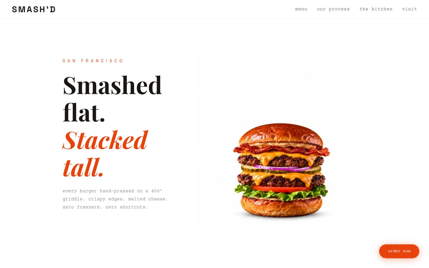
A hand-smashed burger brand needed a site with the same unapologetic energy as their food. We built an editorial magazine experience — bold serif headlines, full-bleed food photography, and a menu display that makes you hungry before you finish scrolling.
SMASH'D is a hand-smashed burger brand built on one philosophy: smash it flat, stack it tall. Their burgers are messy, indulgent, and unapologetic — but their online presence was a generic restaurant template that looked like every other burger joint on the internet.
The brief: build a site that feels like biting into one of their burgers. Bold, messy, satisfying. Not a typical restaurant website with stock photos and a PDF menu link. Something that makes people pull out their phone and order before they've finished scrolling.
Target audience: food lovers aged 18-35 who discover restaurants on Instagram, judge them by their website, and order online. They value personality over polish, authenticity over perfection.
We rejected every restaurant website convention. No hero carousel. No "Welcome to our restaurant" copy. No generic stock photos of smiling families at tables. Instead, we looked at food magazines and editorial design for inspiration.
The headline "Smashed flat. Stacked tall." hits immediately — it's the brand's entire personality in five words. The off-white/cream background feels like thick paper stock, the bold serif headlines feel like magazine covers, and the food photography is shot tight and dramatic.
The orange/red accent color is intentional — it's the color of hot sauce, ketchup, and appetite. It draws the eye to order CTAs without being obnoxious.
1. Editorial, not template. Magazine layout with bold typography and dramatic photography. Every restaurant site looks the same — this one doesn't.
2. Food as hero. Full-bleed, tight-cropped burger photography. No table settings, no restaurant interiors, no people. Just the food, shot beautifully.
3. Menu as content. The menu isn't a PDF download — it's designed into the page with photos, descriptions, and prices. Each item is its own editorial moment.
4. One clear CTA. "Order now" appears at the right moments. Not on every section, not in your face — just where the appetite peaks.
Restaurant template conventions: hero carousels, "About our chef" sections, Yelp review embeds, Google Maps widgets. All of these make a restaurant site feel like a Squarespace template. We replaced them with personality.
We also rejected a dark palette. Burger brands love dark backgrounds because they think it looks "premium." But SMASH'D isn't premium — it's fun, messy, and loud. The cream background with bold black type captures that energy better than another dark-mode food site.
Off-white paper stock, bold black ink, and a hit of orange-red heat. The palette is deliberately simple — it lets the food photography bring the color.
The page is designed like a food magazine spread:
Hero (dramatic burger photo + "Smashed flat. Stacked tall." headline) → Story (brand philosophy and process) → Menu (editorial-style food display with photography) → Gallery (behind-the-scenes and action shots) → Order CTA (prominent call to action)
Lean single-file HTML with no framework overhead. The editorial layout relies on CSS Grid for magazine-style compositions and carefully optimized images for fast load times — critical for a food site where bounce rate directly impacts orders.
No animation framework. This site doesn't need scroll-triggered reveals or parallax effects. The food photography and bold typography carry the experience. CSS transitions handle hover states on menu items — that's all the motion it needs.
Editorial grid. CSS Grid with asymmetric columns creates the magazine spread feel. Menu items alternate between full-width hero shots and two-column layouts, keeping the scroll engaging without repetition.
Image optimization. Every food photo is served at exactly the display size with aggressive JPEG compression. On a food site, a 3-second load time means a lost customer. This site loads in under 1 second on 4G.
The finished site captures SMASH'D's unapologetic personality in every scroll. Bold headlines, dramatic food photography, and a menu display that works harder than a PDF ever could. It's a restaurant site that doesn't look like a restaurant site — and that's exactly the point.
Visit the live site →Tell us about your project. We'll come back with a first idea within hours.